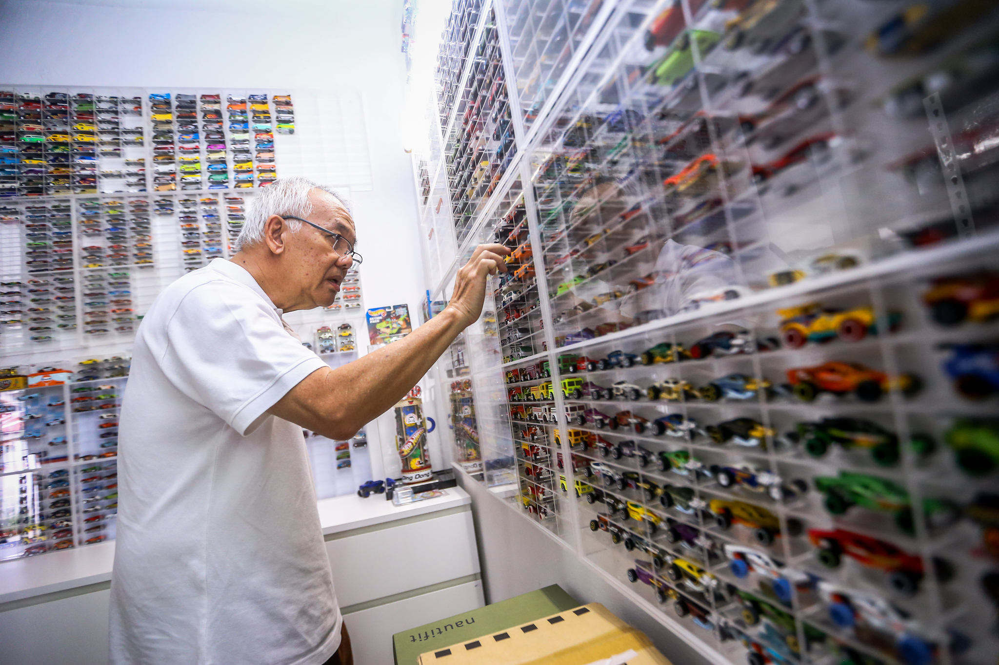
Overview: Toy collectors community is relatively large and Hot Wheels collectors take a biggest chunk of that pie. An average Hot Wheels holds 100 to 200 cars and they cost as low as hundred and goes up to few thousands. So the market is huge and collectors community is growing at a faster pace than ever! Now the issue is how do they keep track of these! As these are not treated as toys and a serious collector treats these as treasures. Excel worked so far as their only choice and they are not that intuitive. Also carrying them on mobile devices is a pain!
Vision: Hobbigator is a web app envisioned by a group of toy collectors, who wanted to track their collection! After been in its initial incubation phase for years, a right team of collectors with multiple discipline ranging from college students to business owner were identified. The team met in a coffee shop over the following weekend and started work.
Scope and constraints: To start this ambitious project, we plan to release a pilot app for evaluation and take it from there. We first need to research, collate data come up with the bare minimal yet core necessity of our users. The only constrain is that we need a team, funds and full time obligation.
Team: This being a part-time project the team did meet over weekend and share thoughts and progress. The team comprises of 5 core members all part-time of course, I played “UX Developer”, “Information Architect”, and “Visual designer”, then there was “Business Analyst”, “PHP Developer”, “SEO Consultant” and “Quality Analyst”.

Process of identifying the issues: We start with “User Research”, create “User Persona” using the data that we have and focus on the “Problem Statement”.
User Research: User research was done using our toy community members both from Indian and international members, thanks to social media like Facebook and Instagram, we managed to get over 100 volunteers and they took the survive via Google docs. This survive had over 15 questions with multiple answers. We also managed to pull some pointers from our meetup and those interviews played a game changing role in this research. Data that came out are pointing us in one direction from diverse user group.
User Persona: With the quantity and qualitative data, we managed to create three user personas as our targeted audience Raju(Student, 19yrs), Jonson(Engineer, 28) and Sentil(Senior Executive, 33). Though we had diverse user base, they all fall into these user persona in one way or another.

Problem Statement: So far spreadsheet (MS Excel or Numbers for Mac users) is the only commercially available solution, which meet their core necessity. But carrying them on their mobile devices is a pain! So a product or solution (mobile app is our first choice but a responsive web app should work too) to be devised to cater to this ever increasing market demand, which could have huge impact.

Information Architecture: Equipped with user expectation, problem statement its time to get my hands dirty creating a sitemap and our team felt that doing it in notepad turns out fast. We had few iteration but the core remained same and user could get through details page in less than 3 clicks. The login and on-boarding part is done via WordPress’s CMS so we leverage that, which also saved us a lot of time. And the final sitemap showed the onboarding as well for clarity.

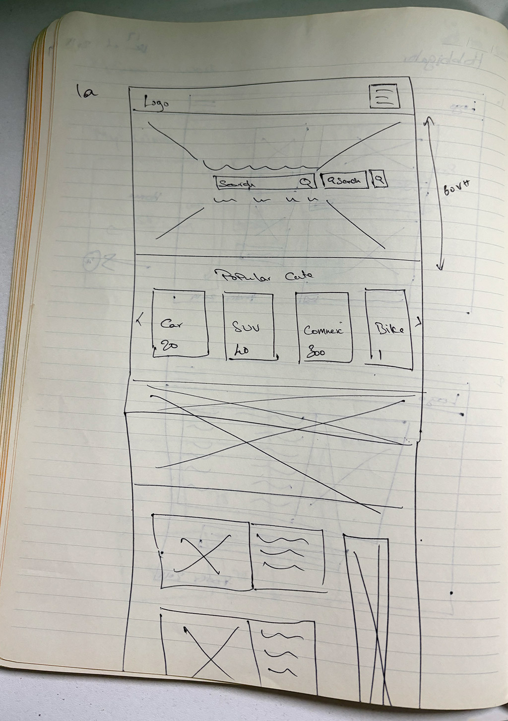
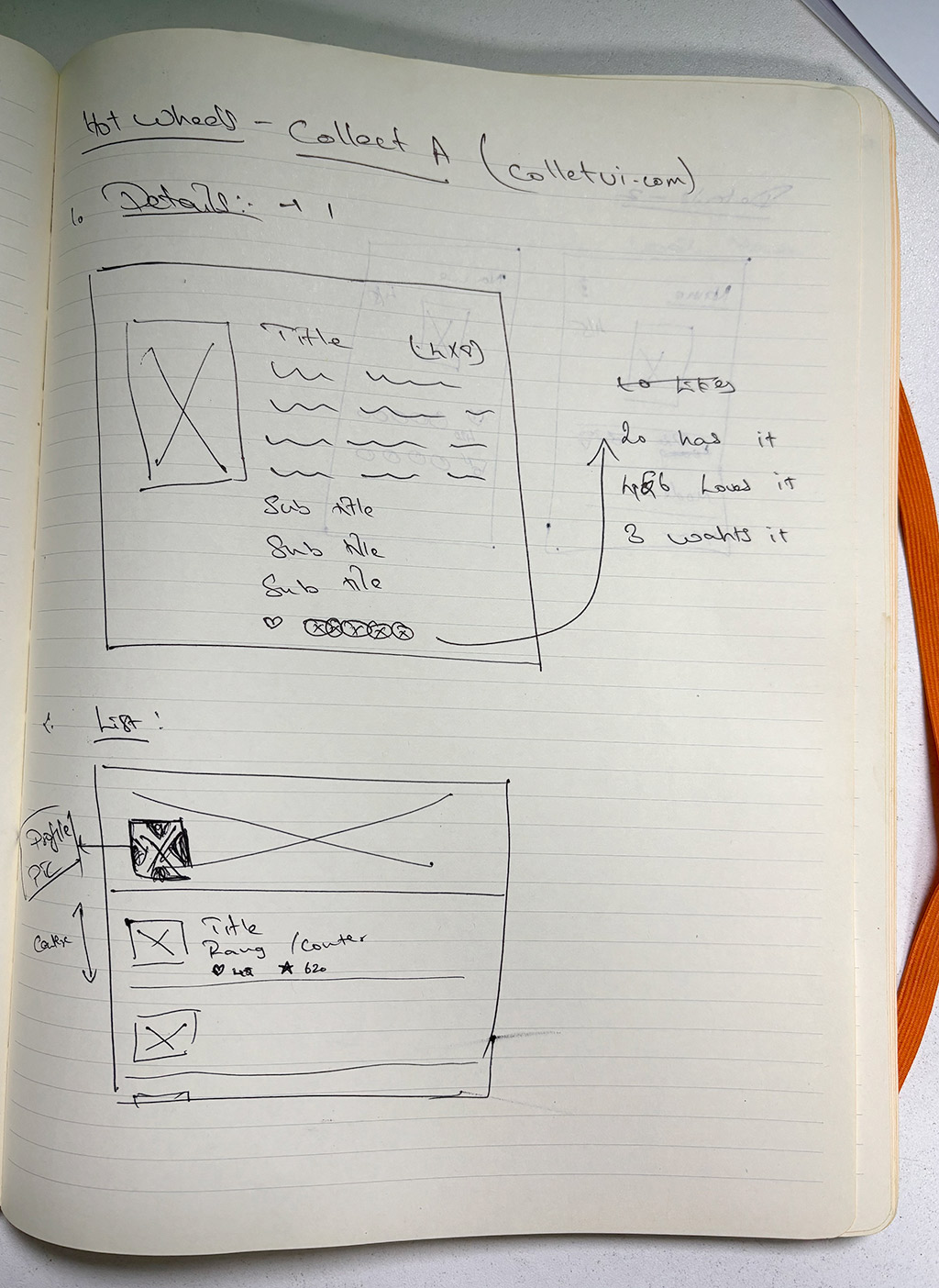
Wireframes: This being a part-time engagement, the team did most of its interaction via zoom calls and Whatsapp communication, we did all of our wireframing on notepads and on sheets of papers. Though a bit primitive it saved as lot of time and engaged the entire team for the most parts. Also the logo was created in the same fashion as it was more engaging.

Visual Designs: Visual design was fully designed by me using Adobe Photoshop and Adobe Illustrator. The UI is not that complicate as our first motto is to deliver simple yet high performance solution. There were only three screens… “Login” screen, “Collection listing” with filters for sorting and stuff. And finally the product details page which is the core of this assignment and done with almost care.
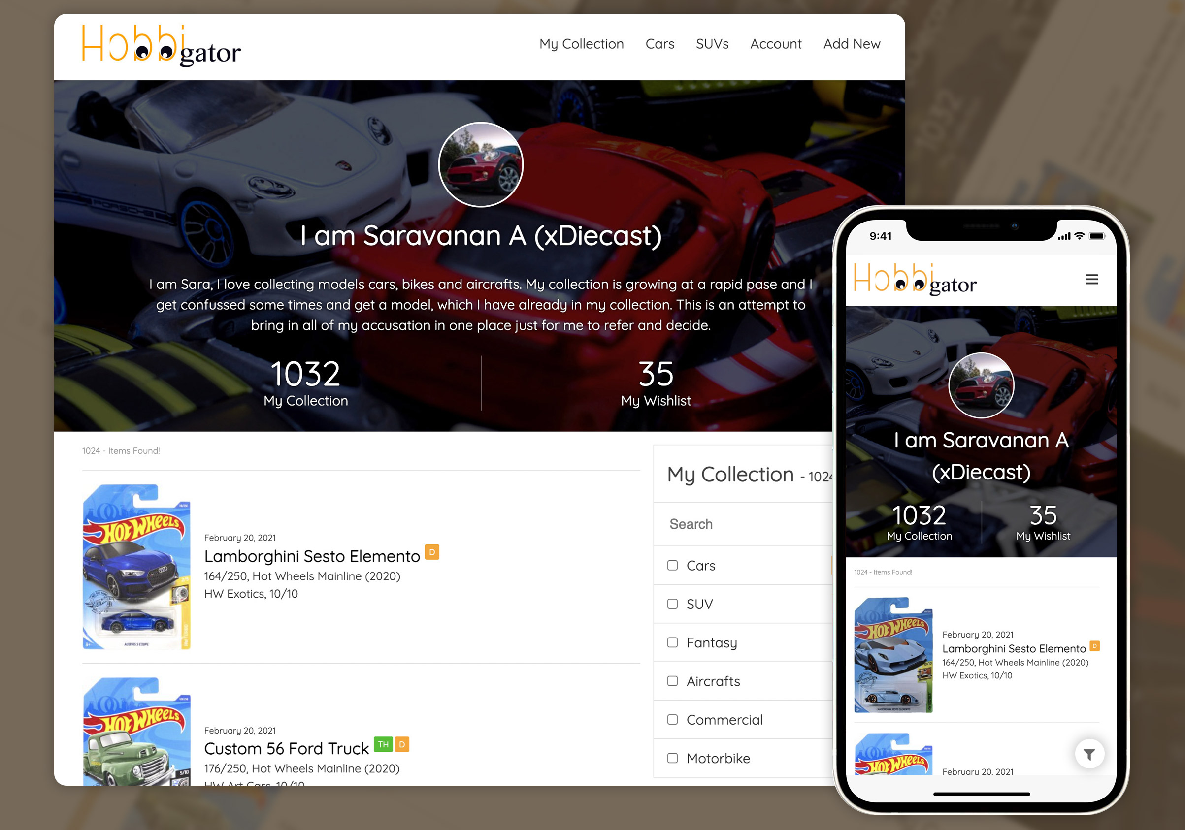
The idea is to show the user’s collection in a list with most relevant details highlighted (visual design here). By default the list don’t show a thumbnail as our research showed not many wanted thumbnail. But thumbnail can be added if users prefer it. Also the major feature that almost all the research participants requested is a filter that let them customise their view, which our filter gave along with a category and count to give them more details as possible without multiple clicks! The mobile version (visual design here) is a shrunken version of the big screen view.
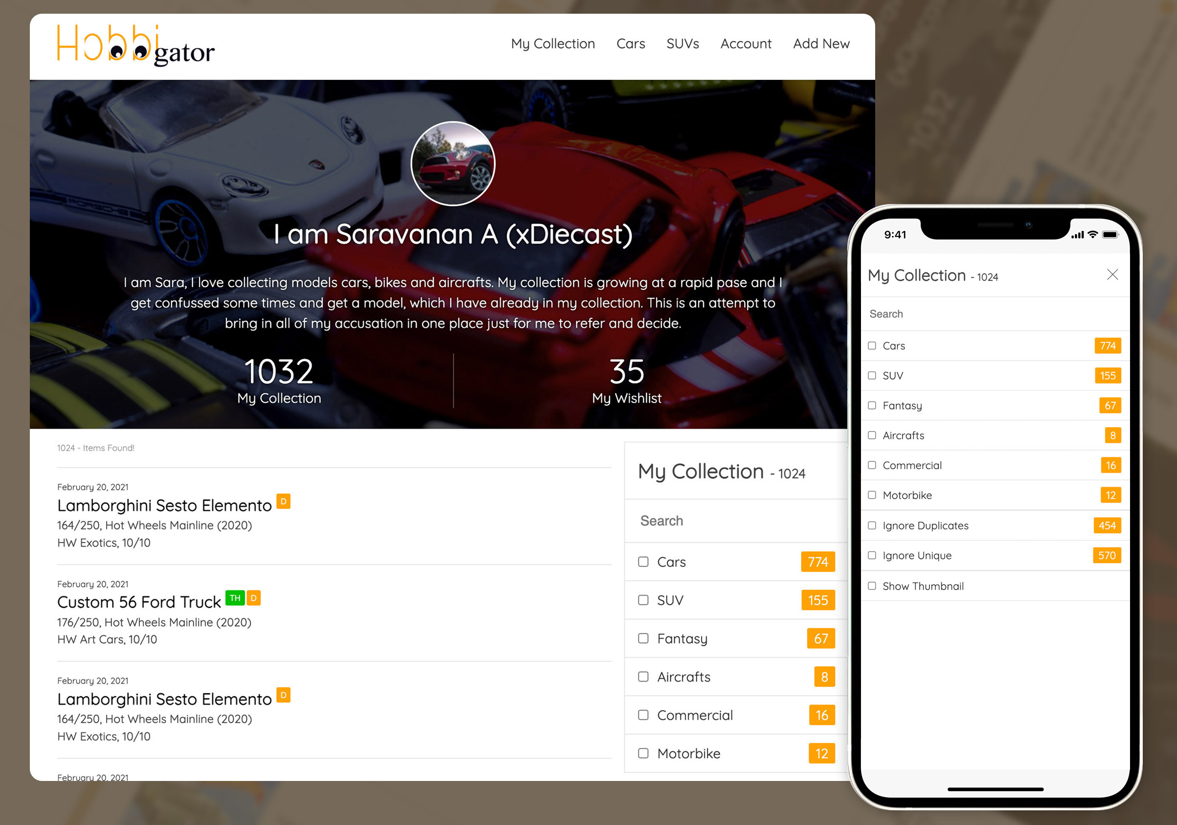
The filter being one of the most requested feature, we spend lot of time and all the time spend on paid off with this very simple yet intutive menu. For the mobile version the filter is hidden by default and is triggered by tapping the filter icon. The filter works magic for the users both in mobile and laptop as it is not that intrusive but intuitive!
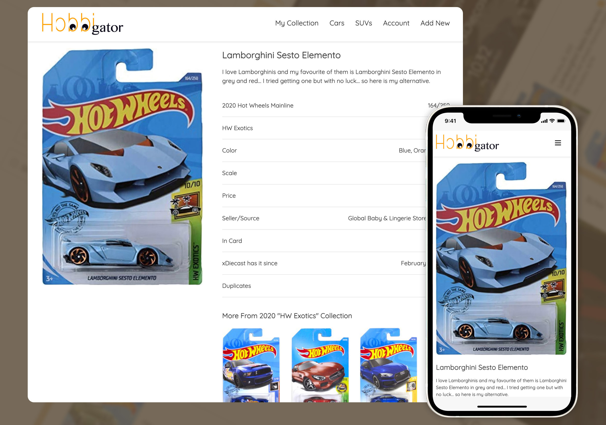
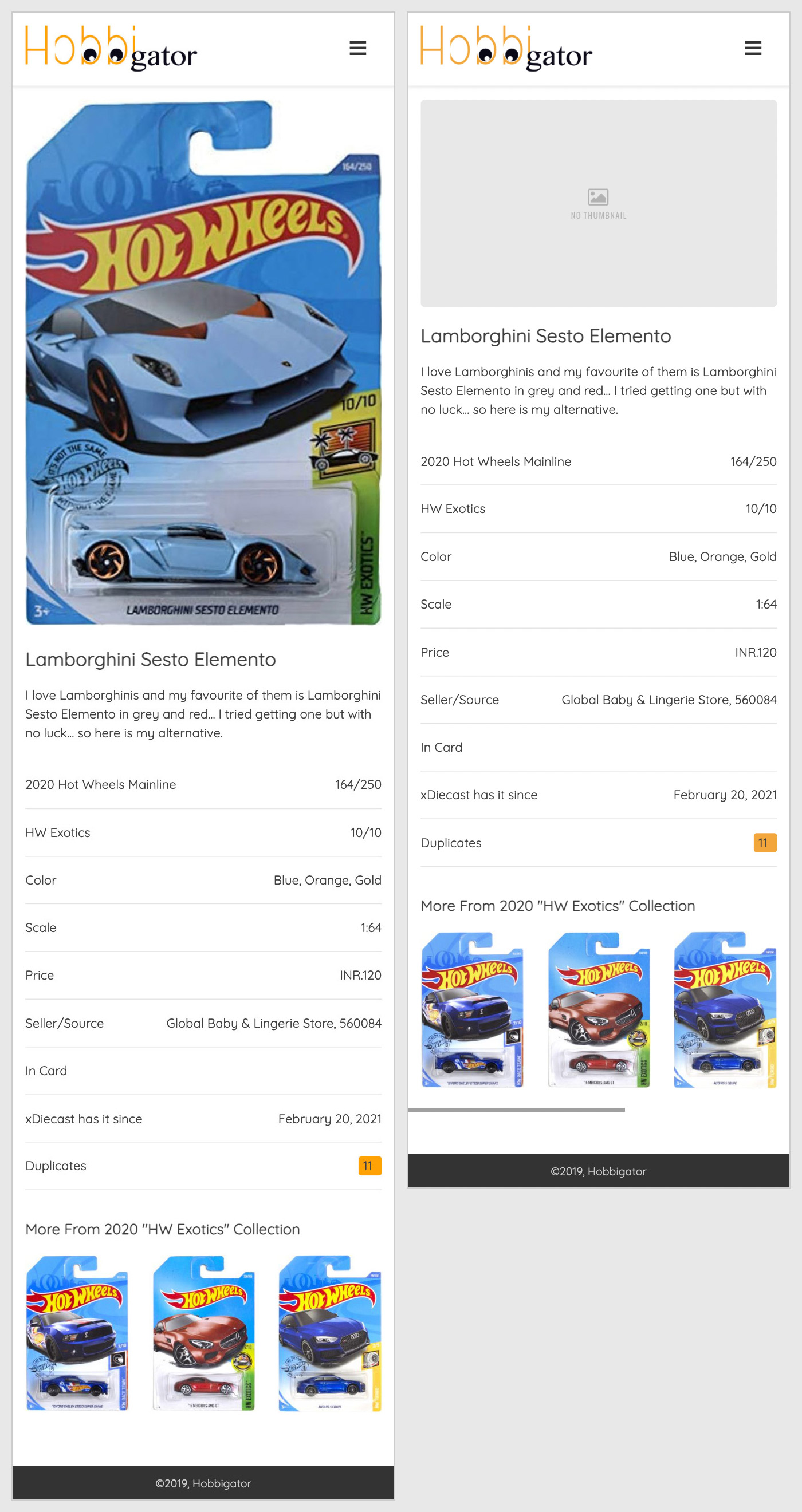
The product details page is one of important page as this shows vital information of their valuable collection in a orderly fashion (visual design here). This page shows one big image of the collection (with option to show more if the user decides to) on the left. The details of the collection are listed on the right in the most intuitive way, these details are not just easily readable but also very organised for the user/collectors to get to the results soon. The mobile version (visual design here) displays the same information but in a single column.
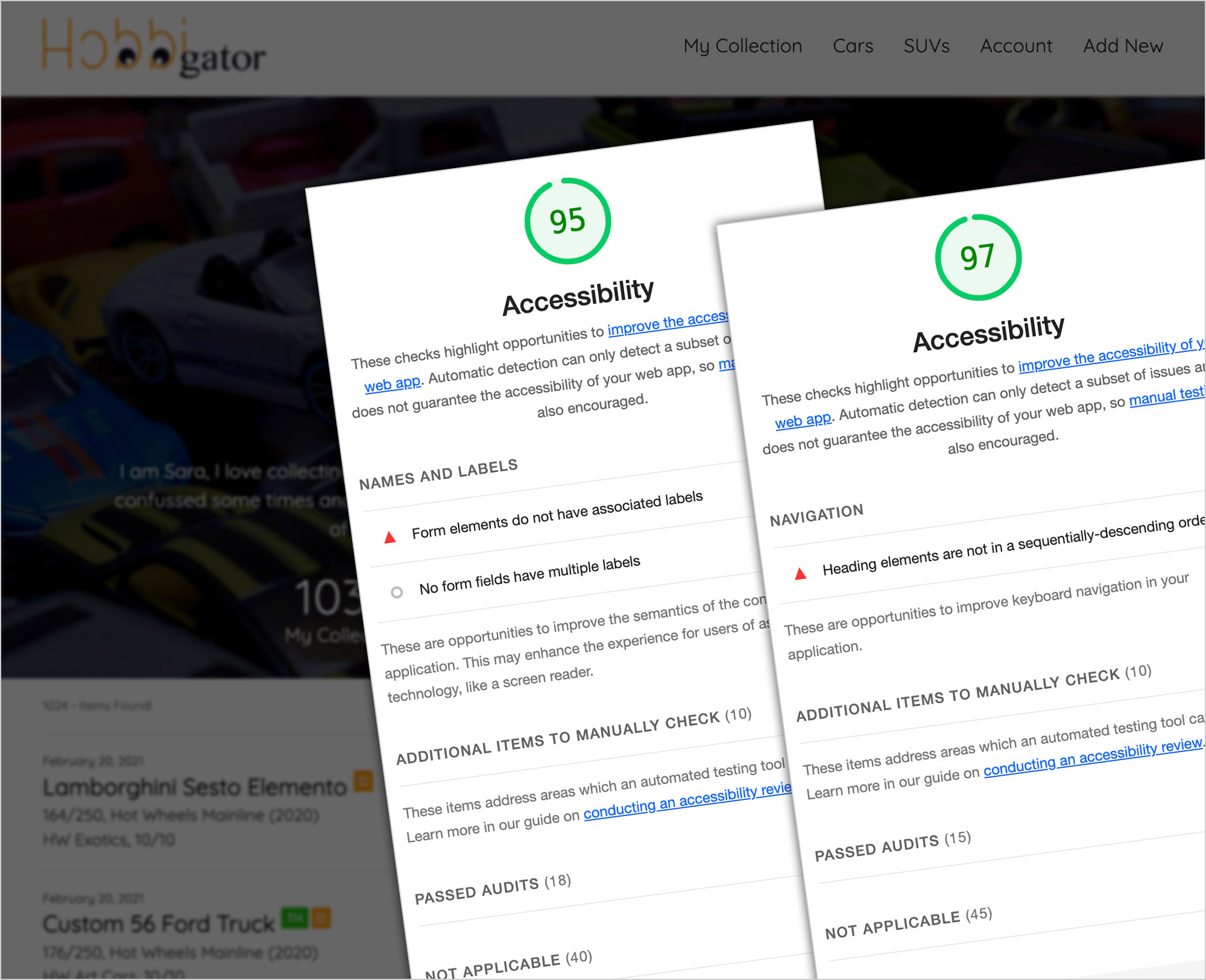
Quality and Accessibility Testing: Our QA tested this web app for mobile and desktop using real devices and emulator provided by chrome browsers. Accessibility testing was done via Google Lighthouse and we managed to get a score of 95(for listing) and 97(for product page), which is relatively good for a pilot project developed over a period of 45days.
Learnings and Takeaways: Though this is a part time engage, that came out of love toys and toy collection, the entire team put their heart and soul into it! And in the process, I learned few valuable lessons…
- Spreadsheets are the easiest form of data representation even though you need a computer to access them.
- Users especially Gen-Zs like mobile apps mobile than web apps even though it takes installing them in your device.
- Adding data is more tricky than viewing them formatted in the ways users want!
Conclusion: This version of app came out good, far better than what we though it would be! Viewing your collection and sorting them the way you want is accomplished. From initial feedback and analytics the user are very happy. With our viewing issue sorted, we need to get back to our data input, which is now uploading your excel into our server. But the users still need to use excel to input data so our users ask is to have an input form for our users enter car details directly! That is already in development so version two will have it, but unfortunately I will have to drop off and get to my other endeavours. Good Luck team.